
Systematic Research Across The Product’s Most Critical Surface
ROLE
UX Researcher
TIMELINE
15 Months (Oct 24 - Dec 25)
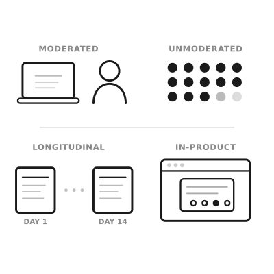
STUDIES
Numerous dedicated studies + continuous in-product feedback collection
Email-related support tickets dropped 56% year-over-year
IMPACT
Key Outcomes & Decisions
Contributed to a 56% reduction in email-related support tickets year-over-year by systematically identifying and helping address friction across the editor
Reframed recurring usability issues as mental model mismatches, influencing broader information architecture decisions
Advised against a planned redesign after research showed no clear user benefit, helping the team avoid engineering investment
Informed product strategy for AI Integration by showing that users preferred AI and traditional templates as complementary, not competing paths
The Situation
Constant Contact's email editor is the most-used product surface in the platform. Over 230,000 customers create emails every month, and the editor is where the majority of their time is spent. But the editor had accumulated friction over time. Users struggled with spacing controls, found drag-and-drop interactions unpredictable, and weren't sure what some of the buttons in the flow would do. The template picker, where users go when they're creating a new email rather than copying a previous one, hadn't been redesigned in years. And a new AI-powered feature, Prompt2Email, needed to find its place alongside existing template selection methods.
These weren't catastrophic problems. Users could still create and send emails. But the friction showed up in support tickets, in time wasted, and in new users who took longer than they should to send their first email. Throughout 2025, leadership was prioritizing a series of improvements across the email creation experience: editor controls, template selection, AI features, content reuse. Each initiative had its own timeline and set of open questions.
How I Worked
As the sole researcher supporting the email authoring area, I jumped in whenever leadership prioritized a new initiative. I was working with the same small group of PMs and designers across all of them, which meant I had strong context on how each piece connected. The questions varied, and my job was to design the right study for each question as it came up.
The methods ranged from large unmoderated tests (70 participants comparing layouts for editing tools) to smaller moderated sessions (7-8 participants for drag-and-drop and content reuse). Some studies directly compared design alternatives, while some were longitudinal. Beyond dedicated studies, I also designed in-product surveys placed in specific spots within the editor, hyperlinked so users could opt in without being interrupted. After changes shipped, we heard from hundreds of users about what was working, what wasn't, and what they expected.
Early on, the team was involved in the research process: reviewing scripts, helping shape the questions, and asking for frequent updates. Over time, they started coming to me with their open questions and counted on me to get actionable answers. Research went from something they thought they had to be hands-on with, to something they trusted me to deliver on.
Moments Where Research Shaped The Product
Over the course of 15 months, research touched many parts of the email creation experience. Here are a few moments where it most clearly changed the direction.
Users don't speak the editor's language
This surfaced early and kept coming back. Most participants couldn't confidently explain what "padding" and "margin" do, even those who said they used these controls regularly. They were essentially playing with controls until things looked right, without understanding what the controls were doing. The team knew there was some confusion around these labels, but the depth of it was a surprise. This wasn't a power-user vs. novice gap. It was nearly universal.
The same pattern resurfaced when we tested drag-and-drop. Users were using "section," "row," and "block" interchangeably because the distinctions didn't match their mental model. When I called out that this was the same terminology problem we'd seen with spacing, just in a different part of the editor, it reframed how the team thought about the editor's information architecture for that project, as well as more broadly.
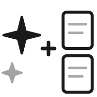
The template picker needed both AI and traditional options
The team was weighing how to position Prompt2Email relative to the existing template picker. Some internal discussion leaned toward making AI the primary path. Research showed a more nuanced picture: across multiple rounds of testing with a decent sample size, AI-generated templates and pre-built templates performed equally well. Users chose based on personal aesthetic preference and brand identity, not because one method was consistently better.
The stronger finding was that users wanted both. They liked the speed of typing a prompt and seeing results, but they also wanted to browse pre-built templates for inspiration. This shaped the recommendation to offer both paths rather than replacing one with the other, and to position AI as a complement to template browsing, not a replacement.

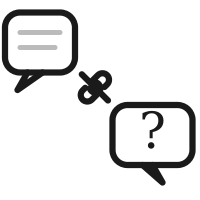
Tying quant with qual
Customer success was seeing low send numbers among trialers, and they suspected it was a naming issue. Research found that most participants understood the unlabeled button would take them forward based on its position alone, which suggested the button label wasn't the primary usability problem.
Adding a qualitative layer over quantitative findings helped the team move past an internal debate and realize what was actually happening, which uncovered a much deeper sentiment.
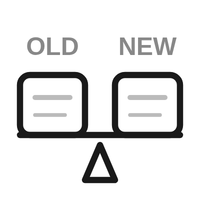
Research showed a redesign wasn't a clear win
Customers struggled with the new controls initially, often leading to unintended consequences and not understanding how things worked. After two weeks of real usage, most participants still preferred the old controls. One participant who had never used the editor before found the new controls easy, suggesting the friction was about unlearning rather than learning.
Research showed the new controls weren't a clear enough improvement to justify the disruption. Product had their own reservations as well, engineering timelines were tight, and the expected lift was uncertain. Research evidence made the team feel confident in deprioritizing the update. Without it, the team would have been making a call based on instinct alone.
The Challenges
The hardest parts of this project were less about any specific study and more about managing research across so many moving parts for more than a year.
Breadth without losing depth
The email editor work touched spacing, drag-and-drop, template selection, AI features, button naming, template picker redesign, and reusable content blocks. As the sole researcher working with the same small group of designers and PMs, staying deep enough in each area to deliver useful findings while covering all of them required deliberate prioritization and tight turnarounds.

Testing concepts at different levels of fidelity
Some studies used clickable prototypes. Others showed videos of interactions because the features weren't built yet. One used the actual product with a feature flag. Each fidelity level required different research design choices, and being transparent with the team about what the findings could and couldn't tell us at each level.

Making research continuous, not episodic
Dedicated studies answer deep questions, but they can't cover everything, especially when changes are shipping on a rolling basis. Setting up in-product surveys extended research's reach beyond what I could study in dedicated sessions, but it also meant designing feedback mechanisms that wouldn't disrupt the user experience and interpreting signal from self-selected respondents.
Impact
Research systematically de-risked changes to the most-used product surface in the platform over the course of a year. It ensured that what shipped was grounded in how users actually interact with the product, and it prevented changes that would have added friction rather than reducing it. The broader impact showed up in the support metrics.
The numbers below reflect the cumulative effect of a cross-functional team systematically improving the email creation experience. Research contributed by catching issues that weren't visible in internal reviews: terminology confusion that was nearly universal, a feature transition that users wouldn't adapt to, and interaction patterns that only surfaced in longitudinal observation. And the in-product surveys kept the signal coming even after changes shipped.
Email Support Tickets
Down 56%
Year-over-year Jan 25 to Jan 26
Overall Support Tickets
Down 41%
SRQ tracks per logged-in customer